Where Data Tells the Story
© Voronoi 2026. All rights reserved.

Income inequality and wealth disparity have been frequent topics of conversation, even before the pandemic upended the economy. Now, inflation and rising interest rates, and a possible recession on the horizon are bringing these societal divides into sharp focus.
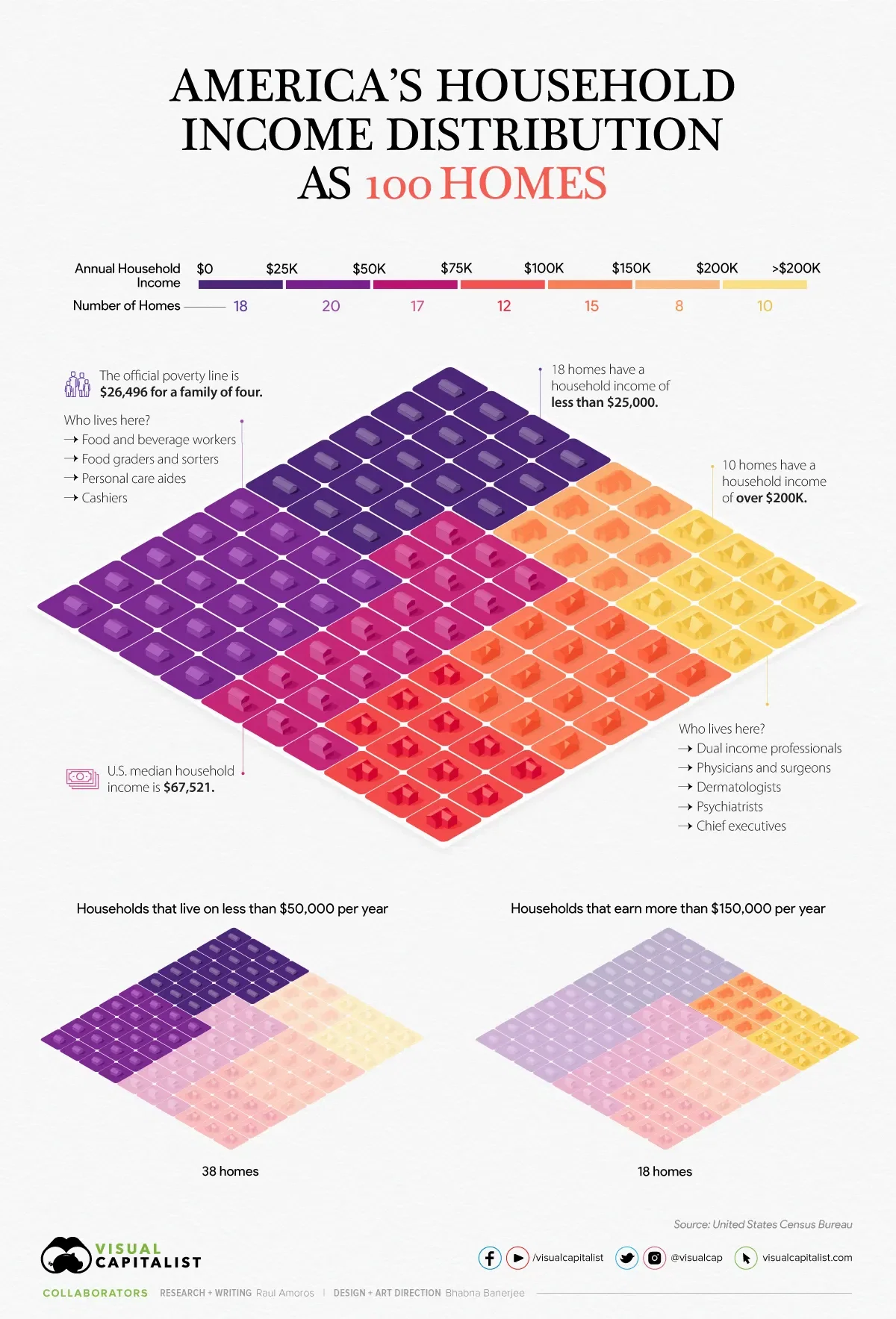
In the above visualization, U.S. households are parsed out into a neighborhood of 100 homes and then grouped by income brackets, using recent data from the U.S. Census Bureau.
American households vary widely on their respective incomes. The largest cluster of homes, representing nearly 20% of all American households, are in the $25-$49.9k income bracket.
In our hypothetical neighborhood, 18 of the households are in the lowest income bracket. People in this category have a wide variety of jobs, but personal care aides, cashiers, food and beverage positions are some of the most common. As a point of reference, the poverty line for a family of four currently sits at $26,496.
On the flip side, in this small community of 100 houses, 33 earn six figures and typically have at least one family member in a corporate or medical role.
See an expanded version of this article on visualcapitalist.com