
Where Data Tells the Story
© Voronoi 2026. All rights reserved.

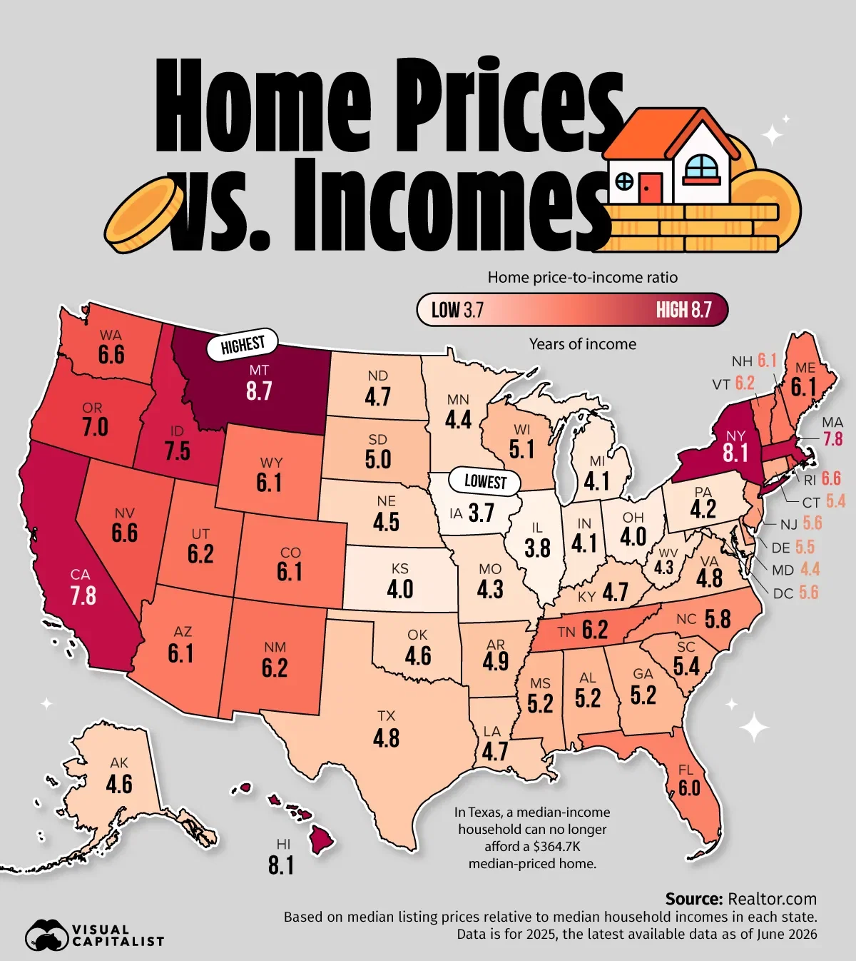
America’s housing affordability map looks very different than it did a decade ago.
Several states that drew new residents with relatively low home prices now rank among the country’s least affordable markets relative to local incomes.
Using median listing prices and median household incomes from Realtor.com, this map shows how many years of income it takes to buy a typical home in every state. The results reveal where home prices have pulled furthest ahead of local earning power.
Read the full article here.