Where Data Tells the Story
© Voronoi 2026. All rights reserved.
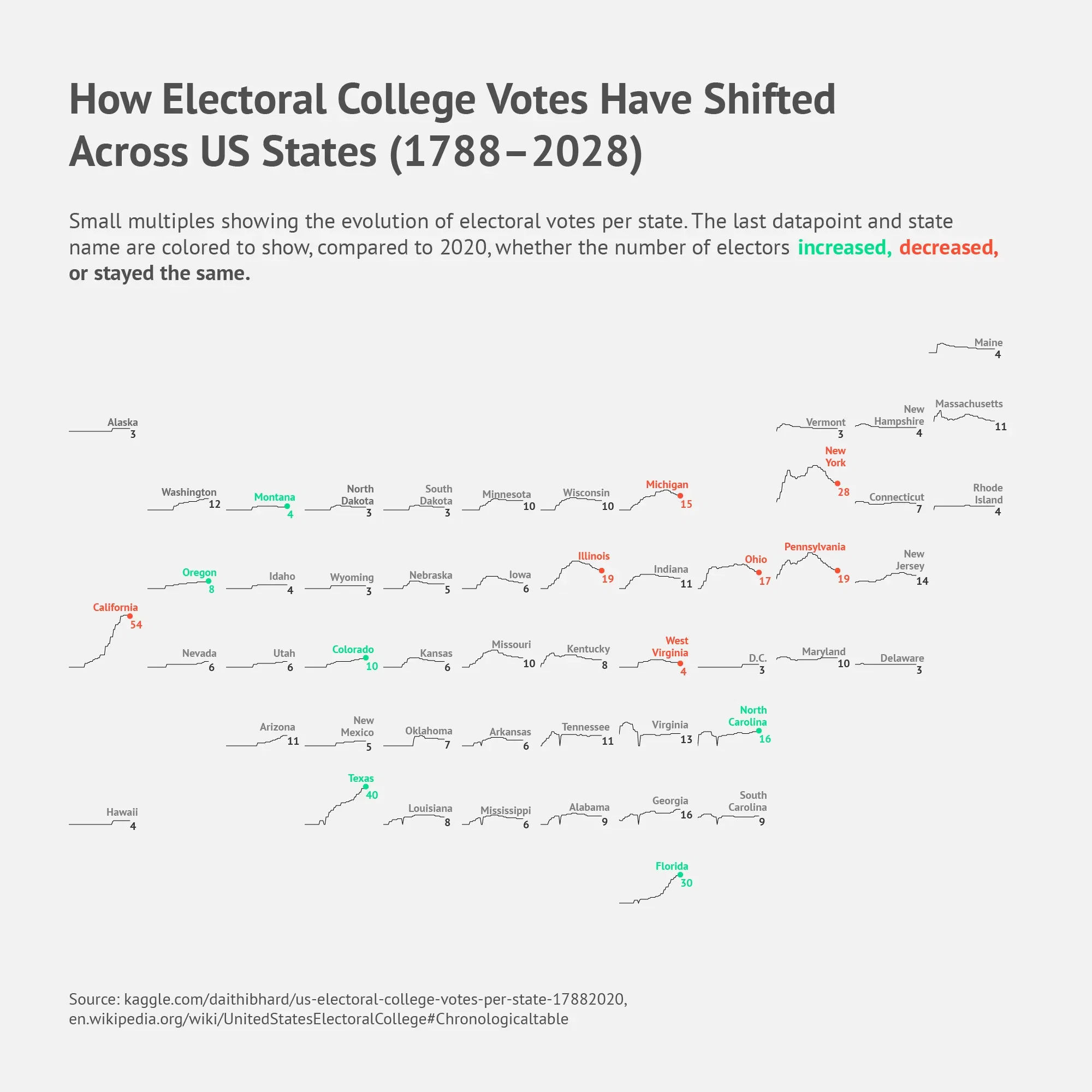
This small-multiples visualization shows how the number of Electoral College votes per US state has evolved from 1788 to 2028.
Each mini line chart represents one state. The final datapoint and state label are color-coded to indicate whether the number of electors increased, decreased, or stayed the same compared to 2020.
The biggest long-term gains appear in fast-growing states such as Texas, Florida, and California, while several Midwestern and Northeastern states show gradual declines. Together, the charts reveal how population shifts continuously reshape the balance of electoral power.