Where Data Tells the Story
© Voronoi 2026. All rights reserved.
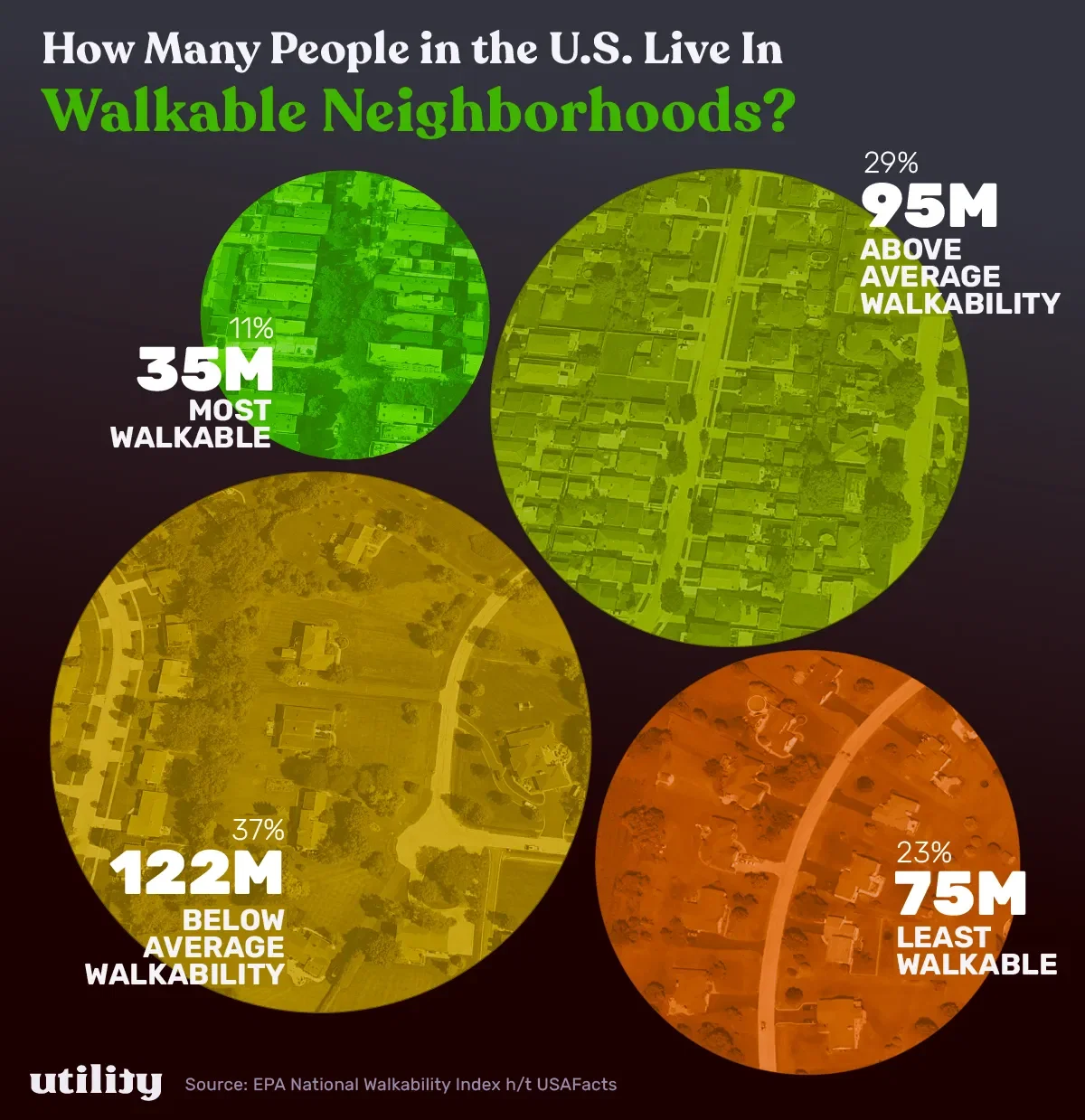
This chart shows a breakdown of how many people (and %) of Americans live in walkable vs unwalkable neighborhoods. "Walkablility" scores come from the EPA's National Walkability Index, and you can see how your own area stacks up in this interactive map.
Not every walkable place is exactly the same, but there are a few elements that are typically found: