
Where Data Tells the Story
© Voronoi 2026. All rights reserved.

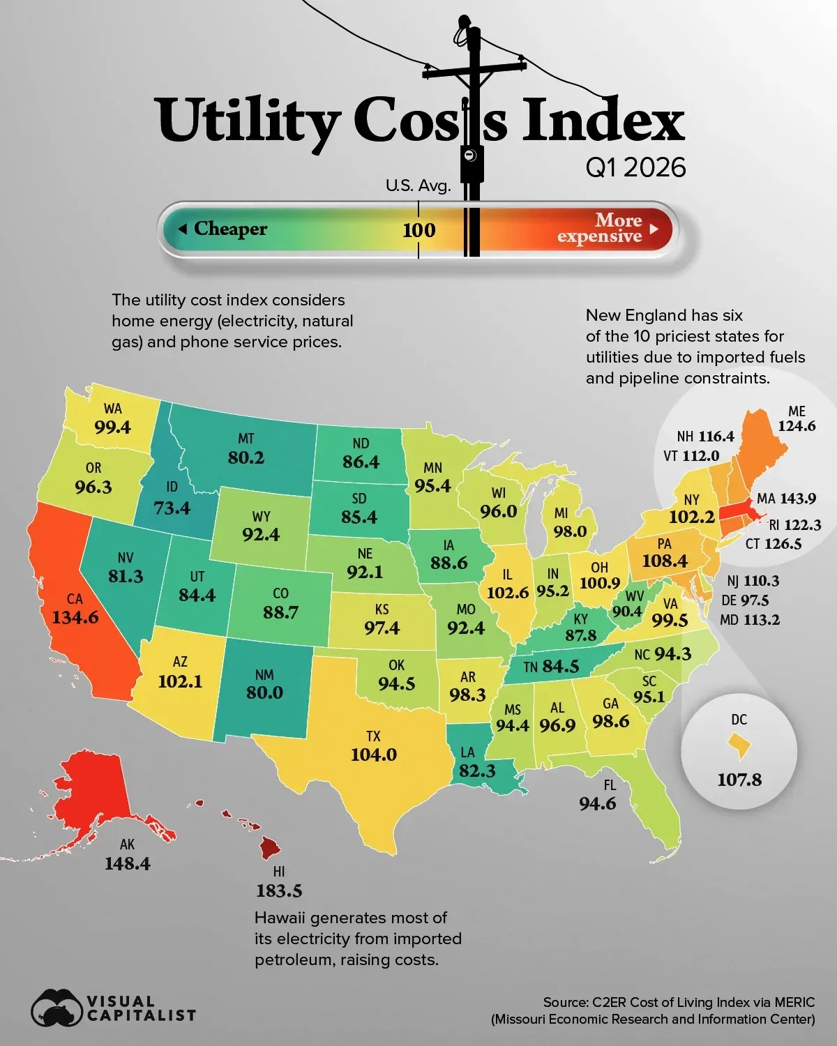
America’s utility map looks surprisingly different from its broader cost-of-living map. Some relatively affordable states have above-average utility costs, while several Western states benefit from access to lower-cost power sources such as hydropower. This map shows the utility cost index for all 50 states and Washington, D.C. in Q1 2026, using the C2ER Cost of Living Index published by the Missouri Economic Research and Information Center(MERIC).
The index measures relative prices for home energy (electricity and natural gas) and phone service in participating urban areas, with the U.S. average set at 100. An index value of 120 indicates utility prices 20% above the national average.
Read the full article here.