
Where Data Tells the Story
© Voronoi 2026. All rights reserved.

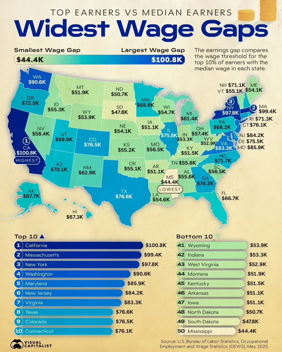
This visualization ranks all 50 states by the dollar difference between the wage threshold for the top 10% of earners and the median wage. It shows where top wages pull furthest away from typical earnings across the country.
The data for this visualization comes from the U.S. Bureau of Labor Statistics Occupational Employment and Wage Statistics (OEWS) for May 2025.
Read the full article here.