Where Data Tells the Story
© Voronoi 2026. All rights reserved.
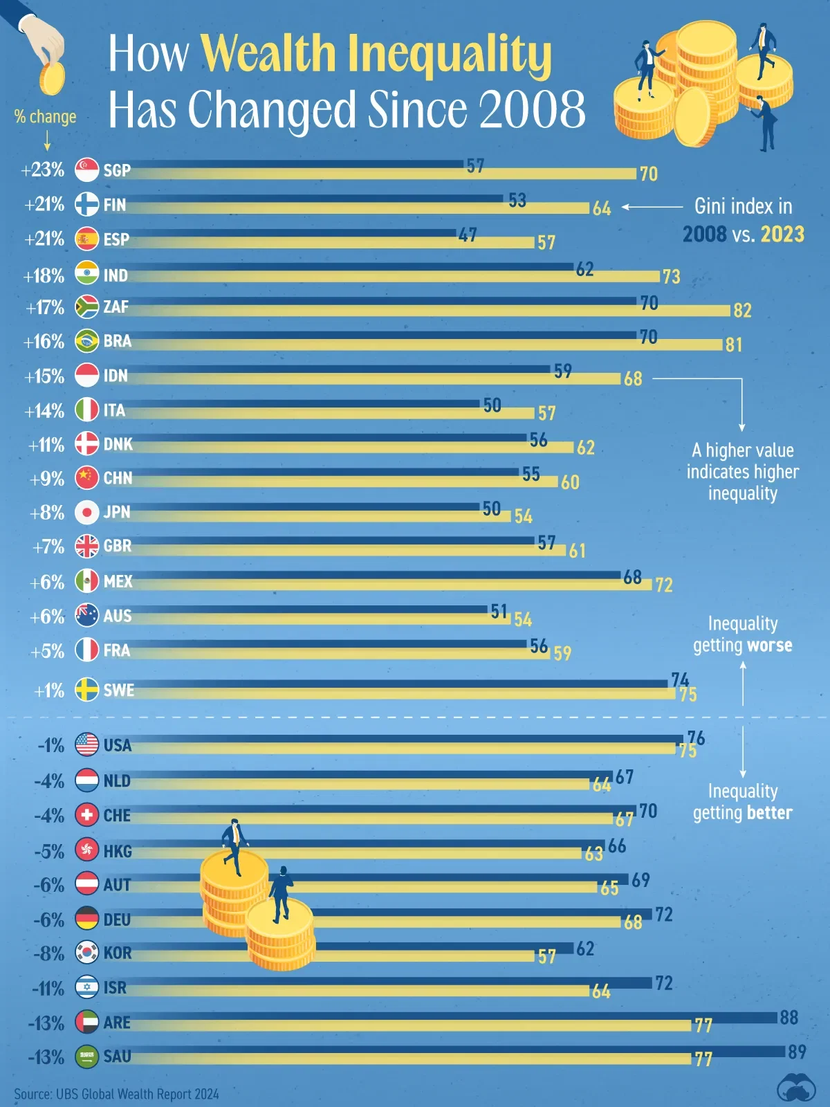
This graphic shows how wealth inequality (measured by the Gini index) has changed in various countries from 2008 to 2023.
Countries above the dotted line have seen their inequality worsen, while those below the line have improved.
This data accessed via the UBS Global Wealth Report 2024.
The Gini index measures income inequality within a population, ranging from 0% (perfect equality) to 100% (maximum inequality), with higher values indicating greater disparity in income distribution.
A country where one person earned 100% of income would have a Gini coefficient of 100%.