
Where Data Tells the Story
© Voronoi 2026. All rights reserved.

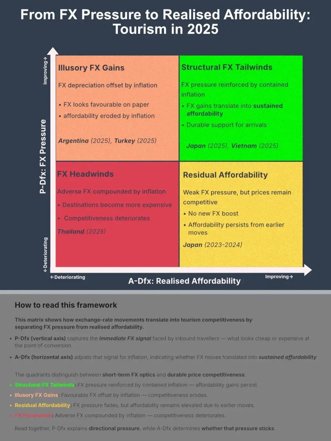
Exchange rates are often cited as a driver of tourism demand — but headline currency moves alone don’t show how tourism affordability actually shifts.
Travellers don’t respond to currencies in isolation. They respond to how affordable a destination appears in their home currency, and whether that advantage survives local inflation.
The Destination FX framework separates these two stages:
The visuals below walk through that transmission — from FX pressure to realised affordability — across global destinations in 2025.
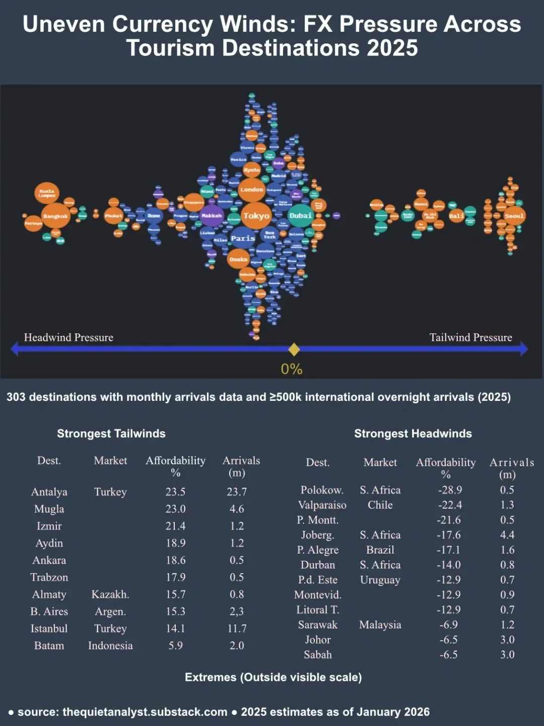
This distribution shows how large the 2025 FX pressure moves were across destinations.
Each bubble represents a destination:
The dispersion is the key story. FX conditions in 2025 were not uniform — they created large and uneven competitiveness shocks across destinations with similar tourism profiles.
Some high-volume destinations experienced strong currency tailwinds. Others faced meaningful FX headwinds.
But FX pressure is only the first step.
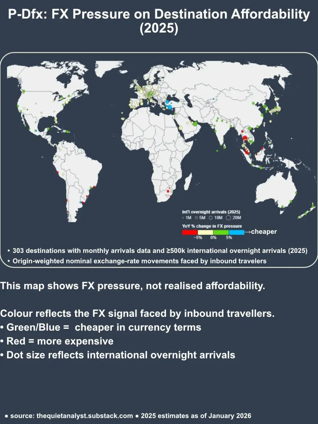
This map shows where those FX pressures were concentrated geographically.
P-Dfx measures the nominal exchange-rate signal faced by each destination’s actual inbound visitor mix, using tourism-weighted exchange rates rather than headline currency pairs.
It captures what travellers see at the point of price conversion — before domestic inflation and repricing take effect.
However, FX pressure does not automatically translate into sustained affordability.
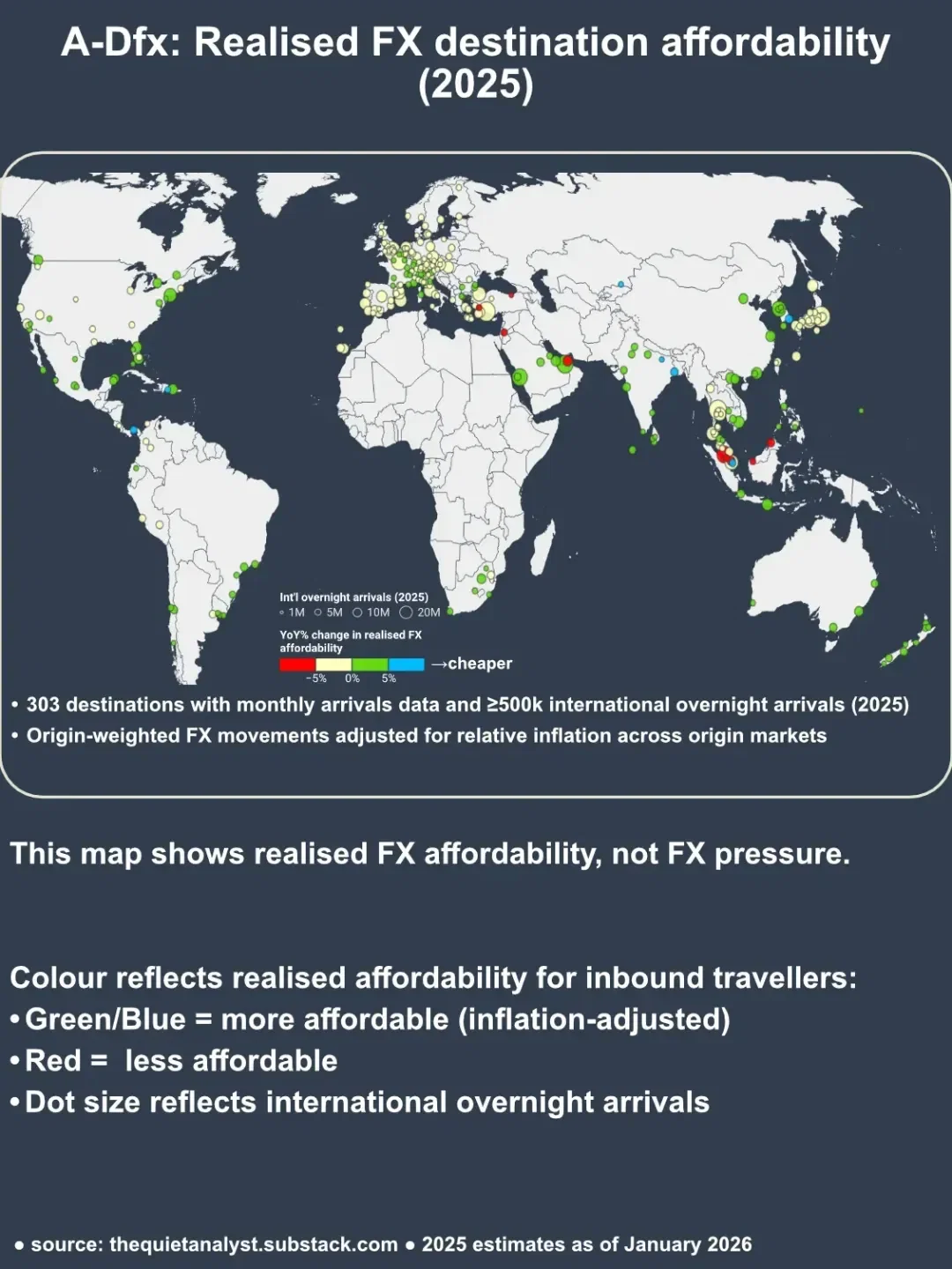
This map adjusts FX pressure for relative inflation between destinations and their origin markets.
A-Dfx shows realised affordability — whether FX tailwinds persisted after local prices, wages, and margins adjusted.
Comparing this map with the P-Dfx map reveals where:
This is where nominal currency signals and on-the-ground price competitiveness begin to diverge.
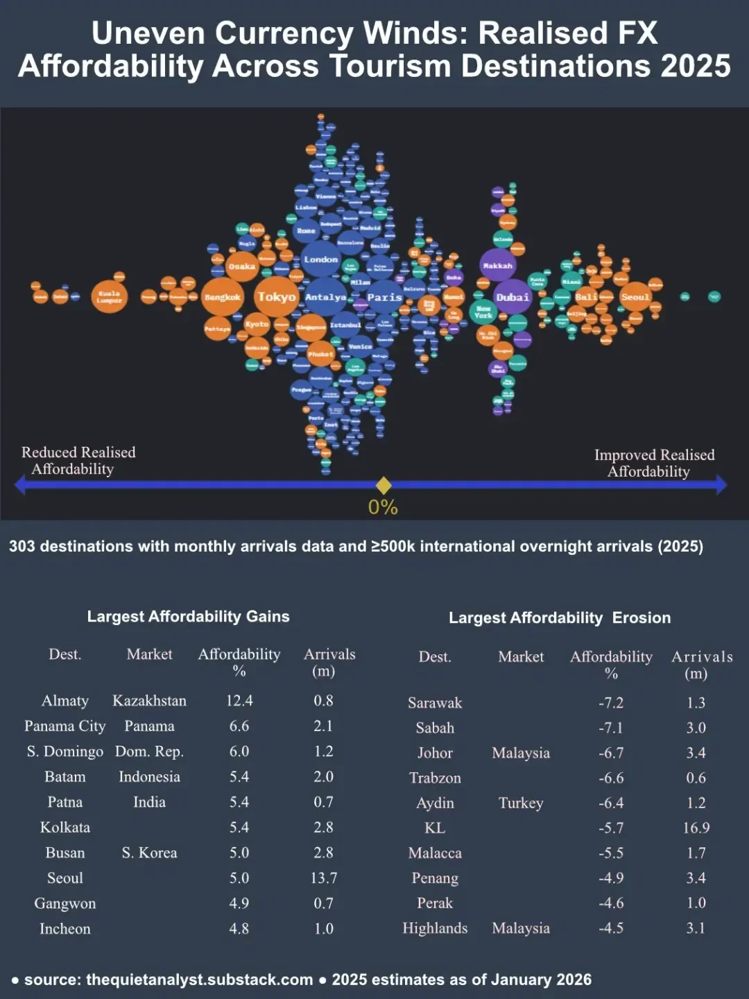
This distribution shows realised, inflation-adjusted affordability outcomes.
The shift relative to the P-Dfx distribution highlights transmission effects:
This confirms a central framework result:
Nominal FX moves explain pressure.
Inflation determines persistence.
Combining P-Dfx and A-Dfx produces four distinct competitiveness regimes:
Structural FX Tailwinds — FX pressure reinforced by contained inflation
Illusory FX Gains — FX looks favourable but inflation erodes the benefit
Residual Affordability — FX momentum fades but affordability remains elevated
FX Headwinds — Adverse FX compounded by inflation
Destinations with similar headline currency moves can fall into very different regimes — which helps explain divergent tourism outcomes and ranking shifts in 2025.
👉 Full methodology, interactive maps, ranked tables, and destination case studies are available on Substack:
👉 Interactive versions of the Bubble Swarm Graphics are available on my Linkedin Newsletter