Where Data Tells the Story
© Voronoi 2026. All rights reserved.
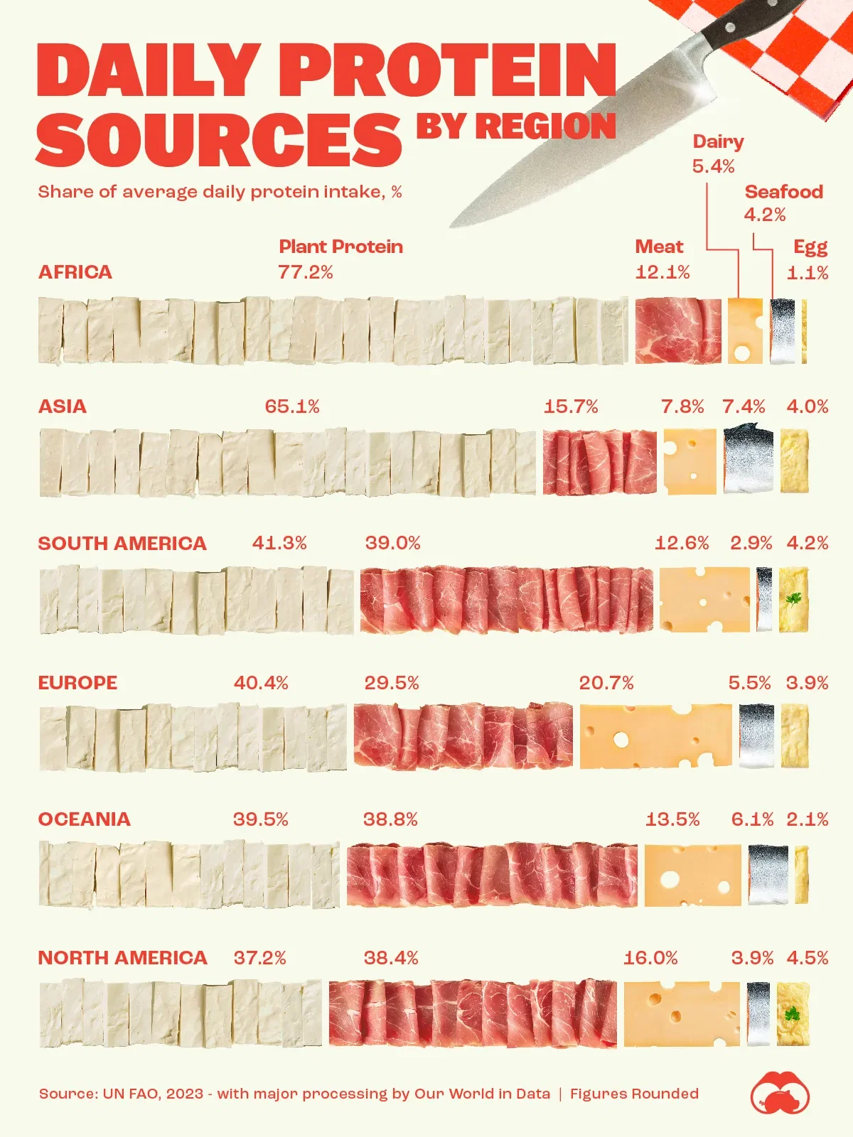
This graphic shows a breakdown of how people in different regions of the world get their protein intake. These figures come from the UN Food and Agriculture Organization (UN FAO), accessed via Our World in Data.
Note that these figures are showing the proportions of how people get their daily protein, meaning each region adds up to 100%. This is different from the actual amount of protein consumed per person (often measured in grams).