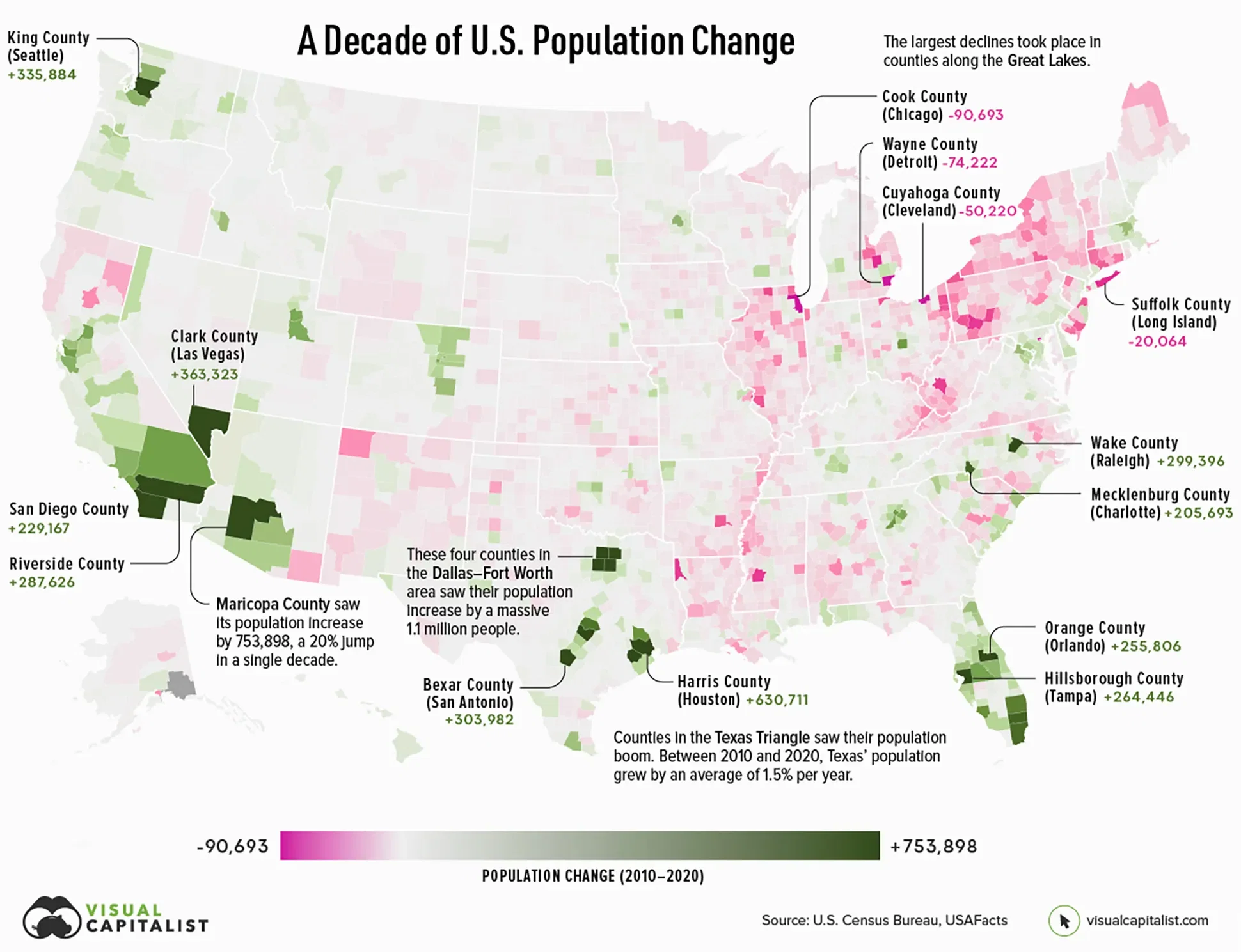
A Decade of Population Growth and Decline in U.S. Counties
There are a number of factors that determine how much a region’s population changes.
If an area sees a high number of migrants, along with a strong birth rate and low death rate, then its population is bound to increase over time. On the flip side, if more people are leaving the area than coming in, and the region’s birth rate is low, then its population will likely decline.
Which areas in the United States are seeing the most growth, and which places are seeing their populations dwindle?
This map, using data from the U.S. Census Bureau, shows a decade of population movement across U.S. counties, painting a detailed picture of U.S. population growth between 2010 and 2020.
See the full article on visualcapitalist.com
Dataset
Rank | County | Point of Reference | State | Pop. Growth (2010–2020) |
---|---|---|---|---|
#1 | Maricopa County | Phoenix, Scottsdale | Arizona | ,753,898 |
#2 | Harris County | Houston | Texas | ,630,711 |
#3 | Clark County | Las Vegas | Nevada | ,363,323 |
#4 | King County | Seattle | Washington | ,335,884 |
#5 | Tarrant County | Fort Worth, Arlington | Texas | ,305,180 |
#6 | Bexar County | San Antonio | Texas | ,303,982 |
#7 | Riverside County | Riverside, Palm Springs | California | ,287,626 |
#8 | Collin County | Plano | Texas | ,284,967 |
#9 | Travis County | Austin | Texas | ,270,111 |
#10 | Hillsborough County | Tampa | Florida | ,264,446 |
Data sources
To calculate population estimates for each county, the U.S. Census Bureau does the following calculations: A county’s base population → plus births → minus deaths → plus migration = new population estimate