Sep 17, 2024
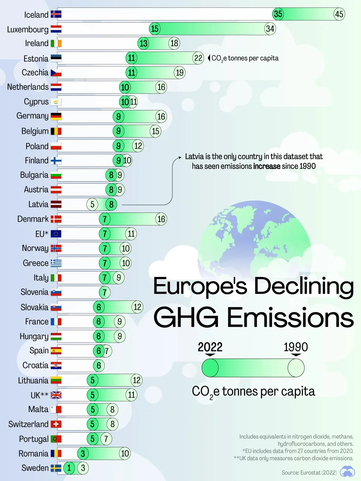
🇪🇺 Thirty Years of Europe's Falling Emissions
What We’re Showing:
This chart tracks the change in net per capita greenhouse gas (GHG) emissions between 1990–2022.
Figures are in carbon dioxide equivalent (CO2e) tonnes and sourced from Eurostat and Statista.
Key Takeaways
- Most European countries have managed to reduce their per capita emissions since 1990.
- This is in stark contrast to many other countries in the world (China, India, Indonesia, Vietnam) whose per capita emissions have increased in the same time period.
Doing the Emissions Math
This graphic tracks emissions generated inside the country. It does not account for how production and manufacturing has moved out of Europe, helping lower emissions. When looking at emissions data attributed to where goods are consumed rather than produced, European countries see less pronounced declines.